test heading
You are about to enter another dimension, a dimension not only of sight and sound but of mind. A journey into a wondrous land of IMAGINATION (and also ink mixing, a whole lot of ink mixing). Next stop, the PRINTING PRESS ZONE! A wondrous land where huge piles of James Patterson’s face lay in stacks (all perfectly matched to his exact skin tone by color experts), machines roar forward in ways that would make any Sesame Street alumn giddy, Giant guillotines cut huge stacks of books, huge lamination machines screenprint spot gloss into just the right spots, and a place where I, amazingly, have yet to reenact an I LOVE LUCY episode and break everything.
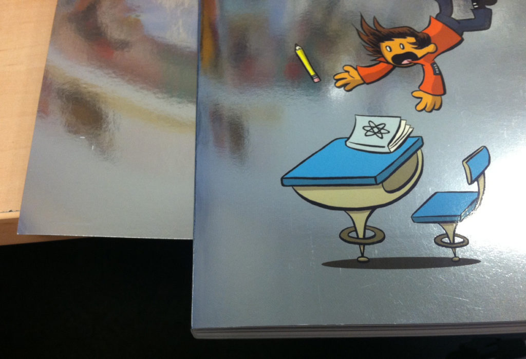
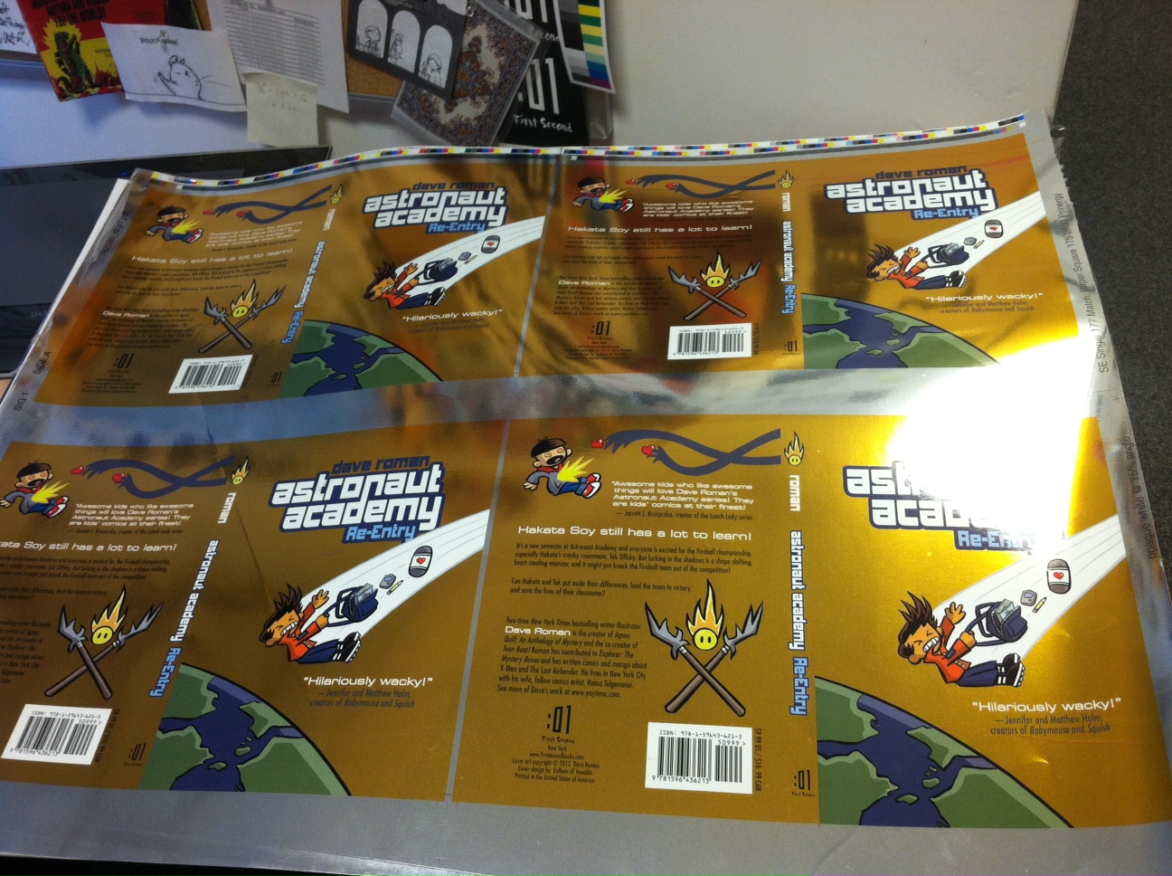
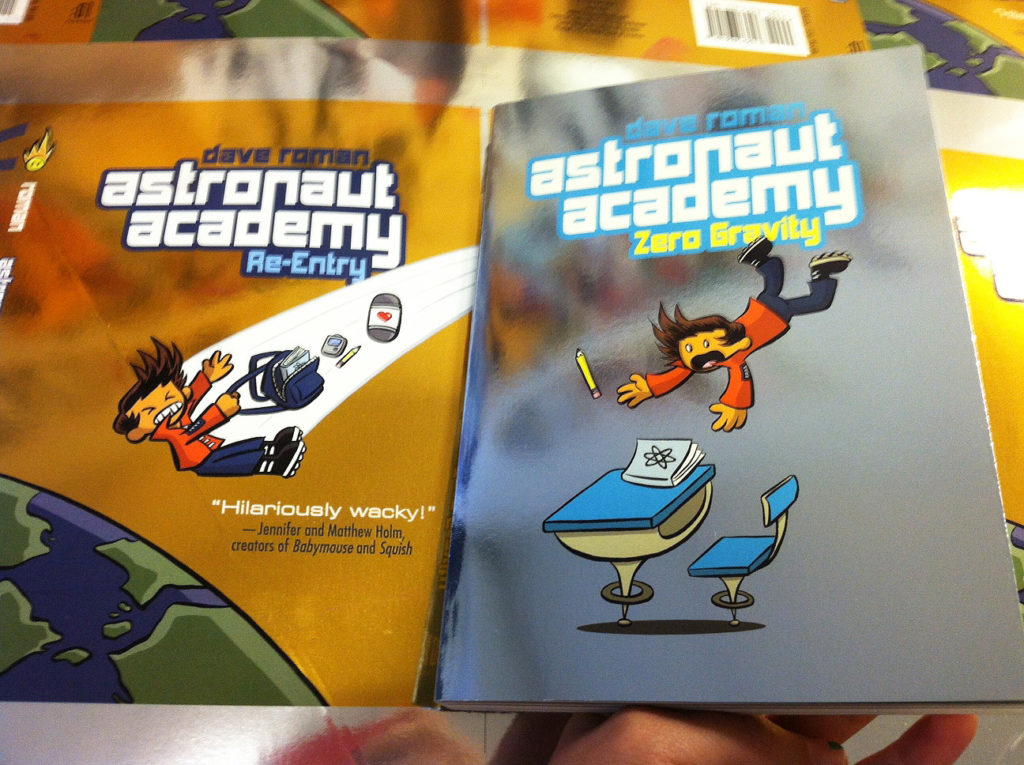
I had the pleasure to go on press to approve Dave Roman’s new Astronaut Academy II cover, since it was a tricky one: A book, printed on silver stock…made to look like gold stock. Sure we could have gone with a generic gold foil, but we wanted something with depth and a richness, something like a well-shined copper coin. You might not even know it but the first book actually wasn’t ACTUALLY pure silver. There was a thin layer of blue printed over the foil stock to give it more weight, personality, and an overall cool tone. (Cool as in color palette, not as in a gif of a dog wearing sunglasses.) You can see the blue here with the book side-by-side with the untreated stock.
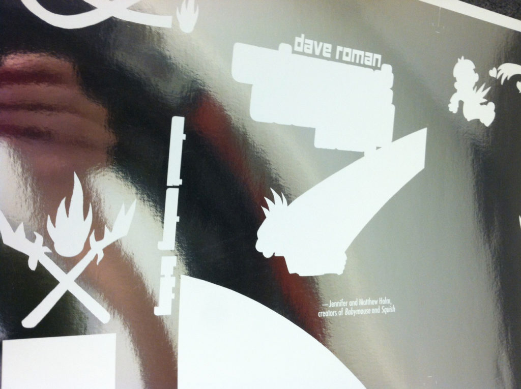
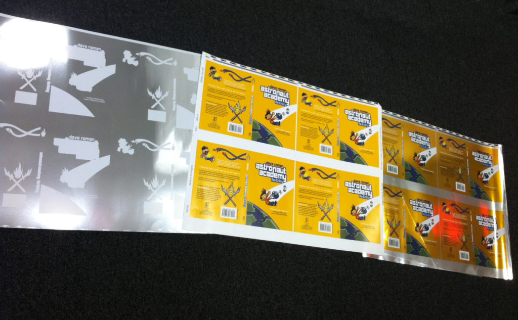
So how do you print on foil? With lots and lots of patience. First thing is the double hit of white. Anywhere we don’t want show-through, ie. the figures, logo, etc., we need to print actual white along with the normal CMYK. Here’s a test proof of the white right after the double hit.
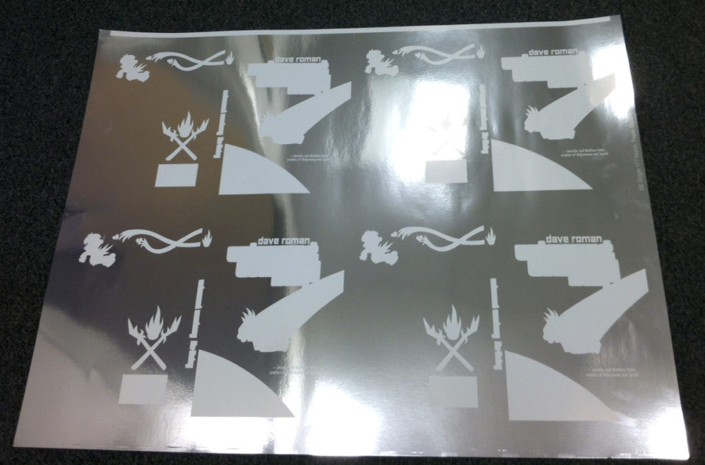
Look at that great quote by Jenny and Matt Holm! Or don’t look at it because it’s invisible!
The next stage is finding the right yellow to print over the silver to get that rich gold we were aiming for. I gave the printer a tiny swatch of gold to try and match, gold that wasn’t made with CMYK and silver. The best thing about people that love the printing process. They don’t say “Oh we can’t do this, it wasn’t made the way we print books!” They say “Woo! A challenge! Let’s go!” They took that swatch and their color experts worked mixing inks until they got the right levels for the background color to be printed over the silver, translucent, letting the foil shine through.
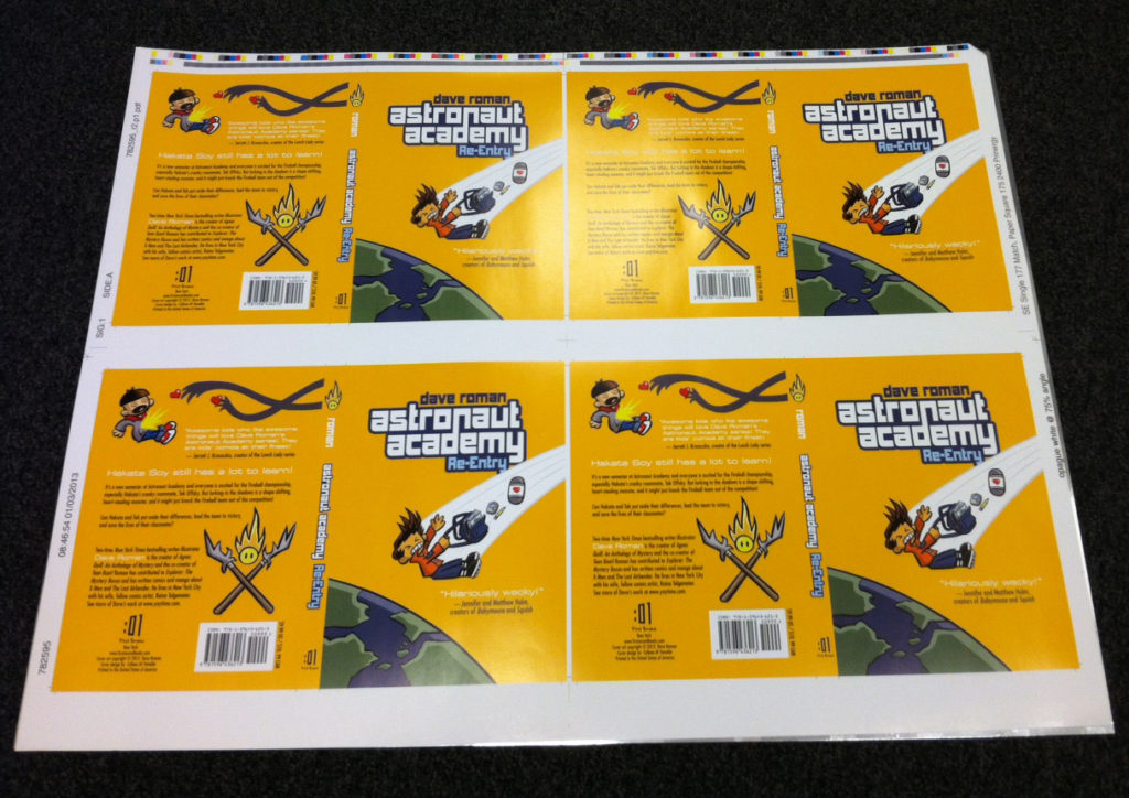
Print that color file over the silver with the double white, then add a thick layer of clear gloss “Lay Flat” film to really make it shine, and you get this: A stunning cover that is also extremely hard to photograph without glare!
Dave Roman has been amazing to work with on these books, and the second is, dare I say it, even more awesome than the first. Can’t wait to hold it in my hand in final book form. Til then I’ll just keep tilting this proof back and forth in the light with a big ol’ smile on my face.
Awesome, thanks for sharing your process. Printing is an art!
This is awesome. Would love to see the printed gold next to a standard gold foil.