test heading
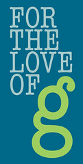 Today’s post is brought to you by the lowercase letter “g” and my love for it. It is, and always has been, my favorite letter in the alphabet. (People have those right?) Lowercase g’s come in such a variety of shapes—from g’s that look like 9’s or even 8’s, to ones with elaborate swoops that don’t worry about defying line height or saying hello to the letters below.
While I’m not a hardcore fan of the font itself, the lowercase g in American Typewriter is pretty impossible to look at and not want to smile. A tiny fat quail of a letter with so much personality that it always looks ready to hop right off the page. So far in my type explorations I have yet to find a designed letter I like more.
As a quick half-hour experiment I made a little tribute: a poster with fifty varieties of the same letter created for the love of g. I thought some of you type lovers out there might appreciate it.

Oh, and just so I don’t feel bad for excluding them, uppercase G’s have their charms as well.
Gee whiz! Stop being amazing! I love your insight that that particular g looks like a quail. Awesome poster. I want the t-shirt.
(Yes, I am reading backward through the blog, that’s perfectly normal, right…?)
Aw thanks! Hmmm…that does put some ideas in my head, Jordan. I’m toying with the thought of designing one of these per letter as a color study, typographical study, and just as an excuse to do that whole “real work” thing they keep trying to make me do here. Maybe I will do “j” second.
This poster has become very popular in our household. I have been getting requests for one like it with the letter j. Just thought I’d pass that on from your fans.