test heading
Sometimes when I’m in the mood to make my brain explode I’ll get caught up wondering how trends happen in design. Was there someone who started it who will never get credit? Did one trend flow and morph into the next, though stepping back they seem so different? Like who was the first person to put a portion of a face on a cover—a major trend so apparent in teen books. (Though it started as the side of the face, then the top half of the face, then jumped down to feet, and is now settling somewhere along the midsection with a lot of headless torso books. If we keep this up one day photographs of elbows on teen covers will be all the rage. Who doesn’t love elbows?! They are very relatable. Most people have them and use the almost every day.)
It’s easier to understand how trends happen now. Information gets passed along on the internet so fast that if you stop paying attention for five minutes the world spins twice. While it’s still really hard to find the genesis, at least the progression of ideas are visible. People liking and linking and stumbling and digging and retweeting and meme’ing and a whole lot of other words that were nonsense sounds until recently. I am happy to say this blog post on origins of trends made me finally learn the name and origin of a very influential modern figure: Keyboard Cat. His real name is FATSO and the footage is from 1984 taken by a man who prides himself in his ability to “nose dance.” Sometimes the internet tells me things I don’t really want to know.
But that’s today with our modern technology, so how did trends flow before there were mass communication systems? How did a movement of art and design work its way from one side of the world to the next overwhelming paintings, architecture, furniture design, advertising… In particular I’ve been thinking a lot about Victorian design, surely one of the oddest movements in all of design history.
Victorian design is generally looked down upon by many modern creators. It was a product of the Industrial Revolution and the rise of a middle class that had never before existed, plus the means to produce products quicker and easier for general consumption. People were proud of their new riches and were quite quick to flaunt, both in purchases and presentation. Consumerism and advertising were truly born in the Victorian age.
Steven Heller and Seymour Chwast say it best in GRAPHIC STYLE: “Victorian taste was confused by the belief that ornamentation and design were identical functions.” Typographers cringe as Victorian letters in a variety of hastily hand created styles are thrown together in ads. “Didn’t have a g? Well an upside b works quite as well!…um right?” During this time there was also little regard for the power of pictures. They believed that words were the true way to express an idea and promote a product or message. Instead it was all about ornamentation. How can you make the type stand out? “Why with borders, banners, generic pointing fingers can make sure you notice those words,” sayth the Victorian ad creators. “I’m pretty sure there’s no way people could find it distracting or confusing or overdone. More leaves! We need MORE LEAVES!”
Sure it’s gaudy, and sure it’s over-the-top and completely defeating its purpose of getting a message across quickly, but I have to say there is such a place in my heart for Victorian design. It was made out of such innocence in many ways, people really excited the world was changing and really wanting to show off how great they were doing. Just like ads, architecture and furniture design valued ornateness over function, but even though most victorian chairs are about as comfy to sit on as a velvet covered slab of concrete, I’ve always found them so beautiful to look at.
")
Thanks to a great retelling of a historical moment, I was given the chance to really dive into the world of the Victorian age for BOOTH, a book by C.C. Colbert and illustrated by Tanitoc. It tells the story before and after the Lincoln assassination, but this time following John Wilkes Booth, his motives, his passions, and his faults. The book is difficult to read because through most of it you find yourself thinking of Booth as a charming character, a ladies man, a hearthrob, trapped in his older brother’s shadow, someone who had a belief (a misguided one) and who stood by it. The charm is a trick and the moments when his true character come forth hit you in the stomach where you go “OHMIGOD! I can’t believe I wanted him to get the girl! He’s a horrible racist, womanizer, and jerk!” It’s an odd thing to read a book where the protagonist is so very flawed and horrible, but yet you can see why so many people were swayed by his charisma.
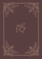 I wanted to integrate some of what I find beautiful in Victorian design, but try to keep the book from going over the top. Along with Calista, our fearless editor, we decided to create interstitials for each chapter. Not only did it offer an opportunity to create suspense within the story, but it gave me a fun design challenge. How do you create a Victorian page that doesn’t distract when, by nature, Victorian design wants to be over-the-top? What I wound up with was a hand-drawn frame, painstakingly mimicked from a traditional Victorian one but with slight variations in line, unevenness in stroke, and variations in size—all in an effort to call back the little imperfections that gave Victorian design its charm. I combined each frame with a small piece of spot art from the chapter ahead. Tiny image with ornate surroundings, just this time missing that silly pointing finger.
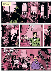
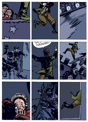
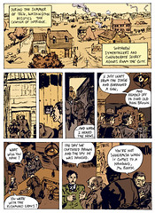
The thing that makes BOOTH so striking in my eyes is the contrast between these deep brown pages and the gorgeous colors for the book. The colorist Hilary Sycamore did such a phenomenal job. She created a variety of palettes each based on the mood and location of each scene. The result reflects back upon this era of people determined to put on a face of eloquence through ornamentation. Bright pink scenes of posh Victorian life, often taking place the drawing rooms and ballrooms of the rich, contrasting the yellows and oranges of the seedier settings, the brothels and bars where the conspirators laid their plans. And then the scenes in the theater…dark, moody blues with thick blacks…and only the slightest bits of red. Haunting red.
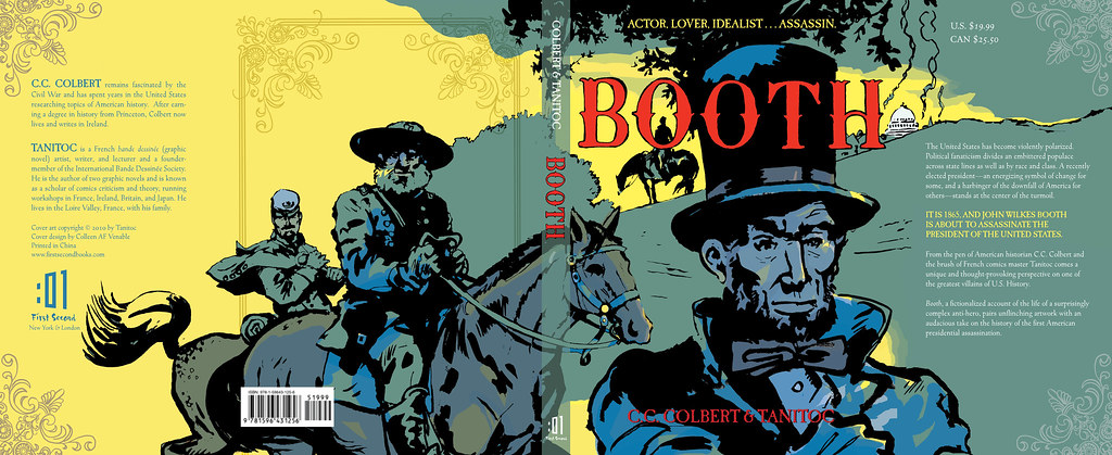
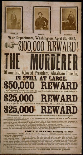
The full cover is above, since I love to see it that way, and wonder how many people really look at books the way I actually create them onscreen. Below is an even more fasinating study…Booth’s actual WANTED Poster. Note the ridiculous changes in text, the pointing finger that makes $100,000 have to be a smaller type than $50,000, and the fact they forget to mention Booth’s name specifically as the Murderer. Or should I say THE……..MURDERER.
Get to know Victorian Design!
Here are some of my favorite entries and collections of images:
HEADACHE PILLS! (also proof that some type in this era was actually
quite stunning and well-done by any modern standards)
BABIES SHAVING! (for some reason, this does seem safe to me) AND
CUCUMBER THEFT!
JELL-O IN VEGETABLE COLOR!
A GREAT STUDY ON PUNCH MAGAZINE…okay so that one wasn’t that funny, but this is a great article on a magazine which many modern illustrators thank for the rise of this form of art being taken more seriously…and we like that very much.
Thanks so much! I am having fun writing these, if you couldn’t tell.
Glad to hear I’m not the only one who loves seeing the full covers. I always tend to sit down and dissect books in the bookstore before I purchase them. Shame libraries always tape them down in plastic!
nice article… and i ALWAYS unfold the cover to see it in full when it’s possible to do so ^^